



Giói Café: creating a visual identity that reflects a world of experiences
From brand conception to visual identity development and brand guidelines, Boigy created a distinctive visual language for Giói Café, connecting the artisanal essence of specialty coffee with a contemporary and sophisticated expression.


and brand creation
For those who appreciate specialty coffee, coffee represents much more than a beverage. There is an entire world of aromas, flavors, origins, and experiences that turns every cup into a discovery.
It was from this perspective that Boigy developed the brand and visual identity of Giói Café, seeking to visually express the relationship between the product, its artisanal essence, and the unique world of those who are passionate about coffee.
The challenge was to create an identity capable of communicating quality and sophistication while establishing a distinctive personality in a market characterized by familiar visual conventions.
The project included logo creation, the development of a visual identity system, and the production of brand guidelines, establishing a consistent visual language for Giói across its different customer touchpoints.
A world of its own for coffee enthusiasts
The central concept of the identity emerged from a simple idea: for true enthusiasts, coffee is a world of its own.
This perception guided the creation of Giói's symbol, conceived as a circular representation that evokes planet Earth and the idea of a unique universe.
Within it, coffee beans form an organic composition, creating a visual representation of this particular world, built around the experience of enjoying specialty coffee.
The intention was not simply to use coffee beans as an illustrative element, but to incorporate them into a concept expressing the relationship between coffee and those who find a singular experience in it.
The symbol thus came to represent the Giói universe: a space of discoveries, sensations, and experiences that extends beyond consuming the product.
The artisanal essence expressed through drawing
Another fundamental aspect of the identity was the appreciation of the artisanal character of Giói coffees.
Although production involves industrial processes, the brand preserves an artisanal essence associated with the care and attention dedicated to the product.
To represent this essence, Boigy chose to draw the coffee beans by hand, using organic, irregular strokes that contrast with the precision of industrial processes.
This choice was intentional: to visually communicate the artisanal care that remains present in the production of Giói coffees, even when industrial processes are involved.
The composition therefore establishes a relationship between two important aspects of the brand: the structure required for production and the attention to detail that characterizes its coffees.
The drawing is therefore more than a decorative element. It communicates a characteristic of the product and contributes to making the identity more expressive and recognizable.
Blue as a strategic choice for differentiation
The definition of the color identity also began with an analysis of the competitive environment.
In the coffee segment, earthy tones, browns, and greens are frequently used to establish associations with the product, its origins, and its production processes.
For Giói, Boigy pursued a different direction.
The choice of a deep blue aimed to create a distinctive visual presence, particularly on packaging and at points of sale, where standing out among competing products plays an important role in brand perception.
At the same time, the shade was selected to preserve the sophistication expected of a specialty coffee brand.
This decision balanced differentiation and elegance, creating a color identity that does not depend on colors traditionally associated with coffee to communicate its positioning.
Blue thus became one of Giói's main elements of recognition, contributing to its shelf presence and the consistency of its communication.
A visual identity built for different applications
Based on the central concept, Boigy developed a visual identity system capable of accompanying the brand in different contexts.
The project considered the relationship between symbol, logo, typography, colors, and graphic elements, establishing a contemporary visual language consistent with the universe conceived for Giói.
Versatility was one of the fundamental criteria of this development.
The identity needed to work in both small-scale applications and larger formats while preserving legibility, recognition, and personality.
This consideration extended to applications on packaging, communication materials, and digital environments, ensuring that different touchpoints shared a consistent visual expression.
More than creating a logo, the work involved developing a system capable of sustaining the brand's presence and accompanying its evolution.
Brand guidelines and identity preservation
To guide the use of the visual identity, Boigy also developed Giói Café's brand guidelines.
The document establishes guidelines for applying the logo, colors, typography, and other elements that make up the visual system.
Its purpose is to preserve the integrity of the identity across different materials and formats, providing references for professionals and suppliers involved in producing new assets.
This documentation helps maintain communication consistency and prevent applications that compromise the characteristics established during the project's development.
By bringing these guidelines together, the manual establishes a foundation for Giói to expand its presence without losing the unity of its visual expression.
The Giói Café project demonstrates how the creation of a visual identity can draw on the unique characteristics of a product to build a brand with personality.
From representing a universe dedicated to coffee enthusiasts to hand-drawn beans expressing its artisanal essence, every choice was guided by a concept. The color definition, in turn, added a strategic dimension to the project, connecting sophistication with differentiation at the point of sale.
The result is an identity that translates the world of specialty coffee into a distinctive visual language, conceived to make Giói recognizable across different experiences and touchpoints.
Our work,
across different contexts.
Explore a selection of projects that reflect our work in marketing,
creative services, and technology, developed for companies
with their own needs and objectives.

Nadia
Discover how Boigy translated Nadia’s sophisticated identity into an e-commerce experience connecting design, technology, and business strategy.

Club Med Brasil
A multilingual platform automating artist recruitment, performance management, and digital contract formalization.
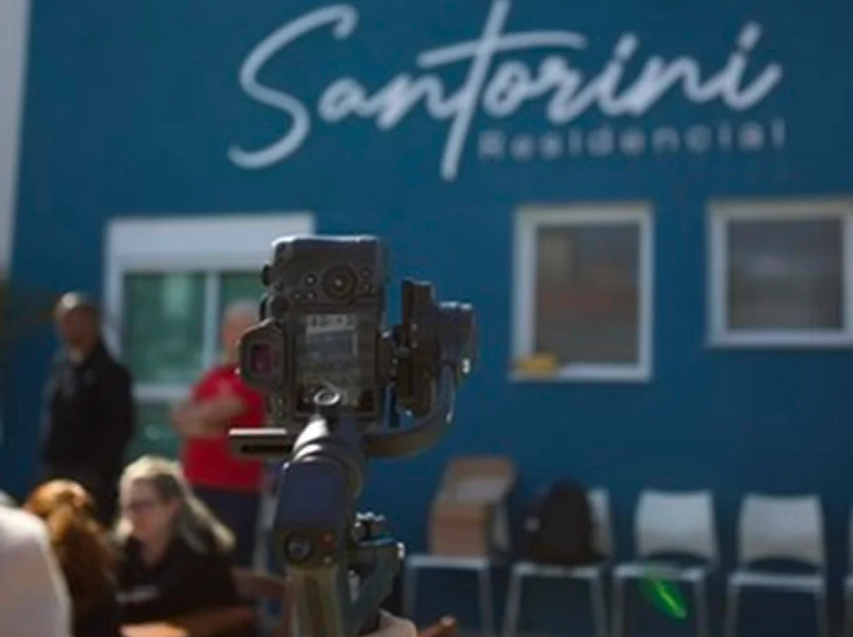
Damebe Construtora
An ongoing approach that integrates media planning, performance campaigns, paid media management, and audiovisual production to generate commercial opportunities for Damebe Construtora’s real estate developments.

Mogi Basquete
A six-episode audiovisual series combining artificial intelligence and cinematic storytelling to introduce Mogi Basquete’s 2026/27 season.
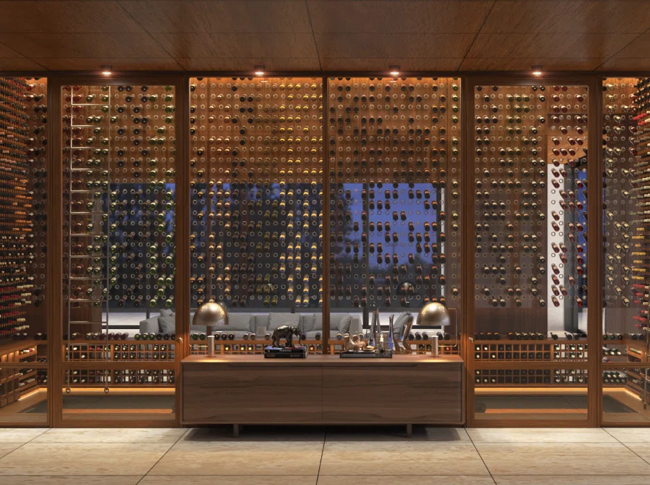
Joshua Adegas Climatizadas
A web development project connecting history, design, and technology to strengthen the positioning of a brand with nearly five decades of tradition.

Catapult by Ranked Music
From strategic conception to technological architecture, Boigy helped create a platform connecting artists and record labels with music marketing solutions, bringing campaigns, data, and integrations together in a single digital environment.
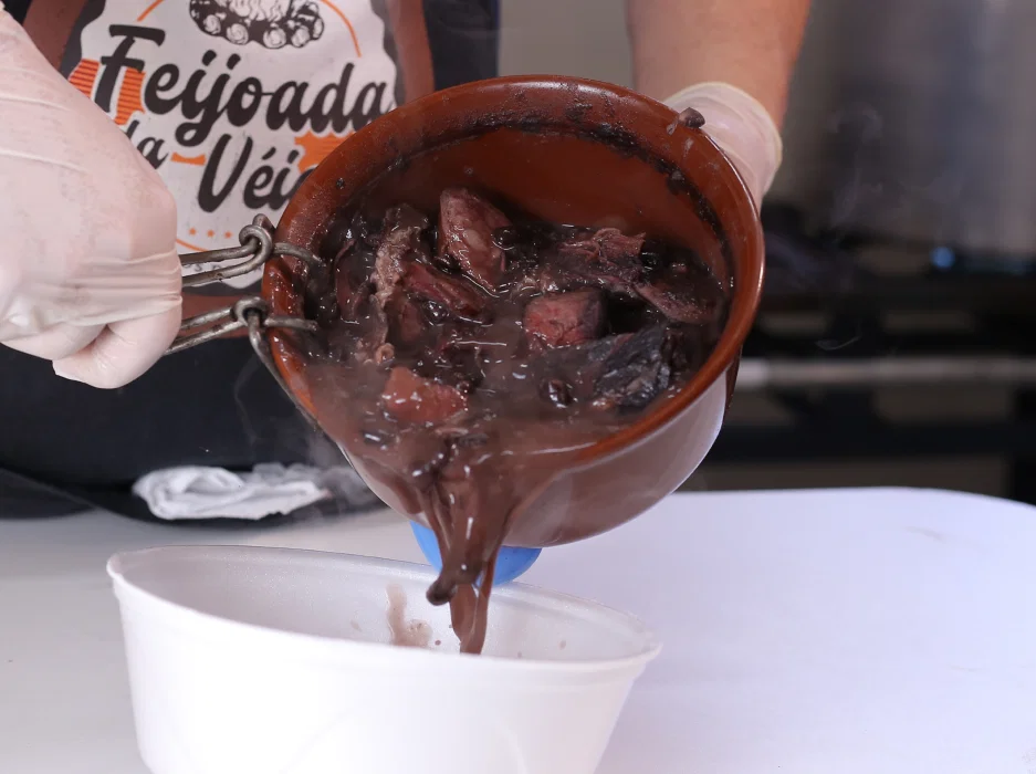
Feijoada da Véia
With automation and advanced marketing strategies, Feijoada da Véia has become the best-selling and top-rated feijoada in Mogi das Cruzes.
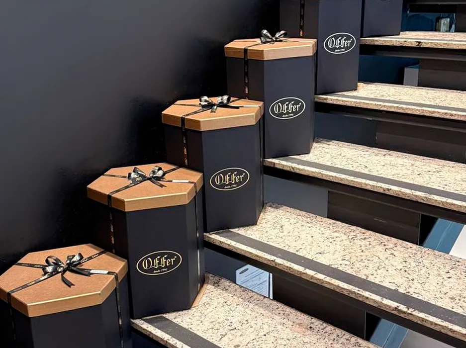
Offer Importados
The strategies expanded the brand's reach to 438,000 people, with 48 successful campaigns and 337 creative designs.
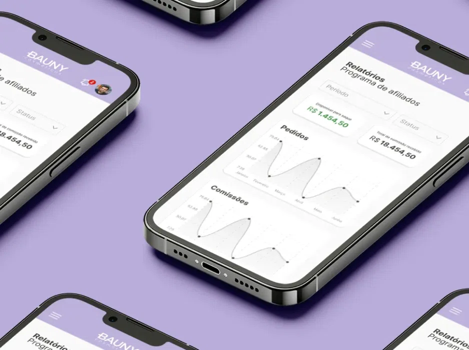
Bauny Cosméticos
A complete platform for influencers to manage commissions and orders, integrated with VTEX and SAP, driving brand growth.
Meaningful conversations
open up new possibilities.
Every business is at a different stage. Tell us about yours, the challenges you face, and where you want to go. A great partnership could start right here.